Tuesday, 1 May 2018

Monday, 30 April 2018
Post production- ancillary poster improved
After receiving feedback from my target audience, the overall feedback was to alter the position of some of the text and perhaps change the text colours. They also mentioned that i needed to stick with the typical conventions of a poster, meaning i needed to add small print and make the main image the main focus of the image.

I also added the ident but simply reversed the colouring on photoshop in order to fit in with the black background. The title of the film, i also changed slightly by reducing the stroke in photoshop to make it appear broken. I changed the font for the actors in order to be able to read their names more clearly. The tag line has remained in the same place and also the font has stayed the same as it fits well with the title.
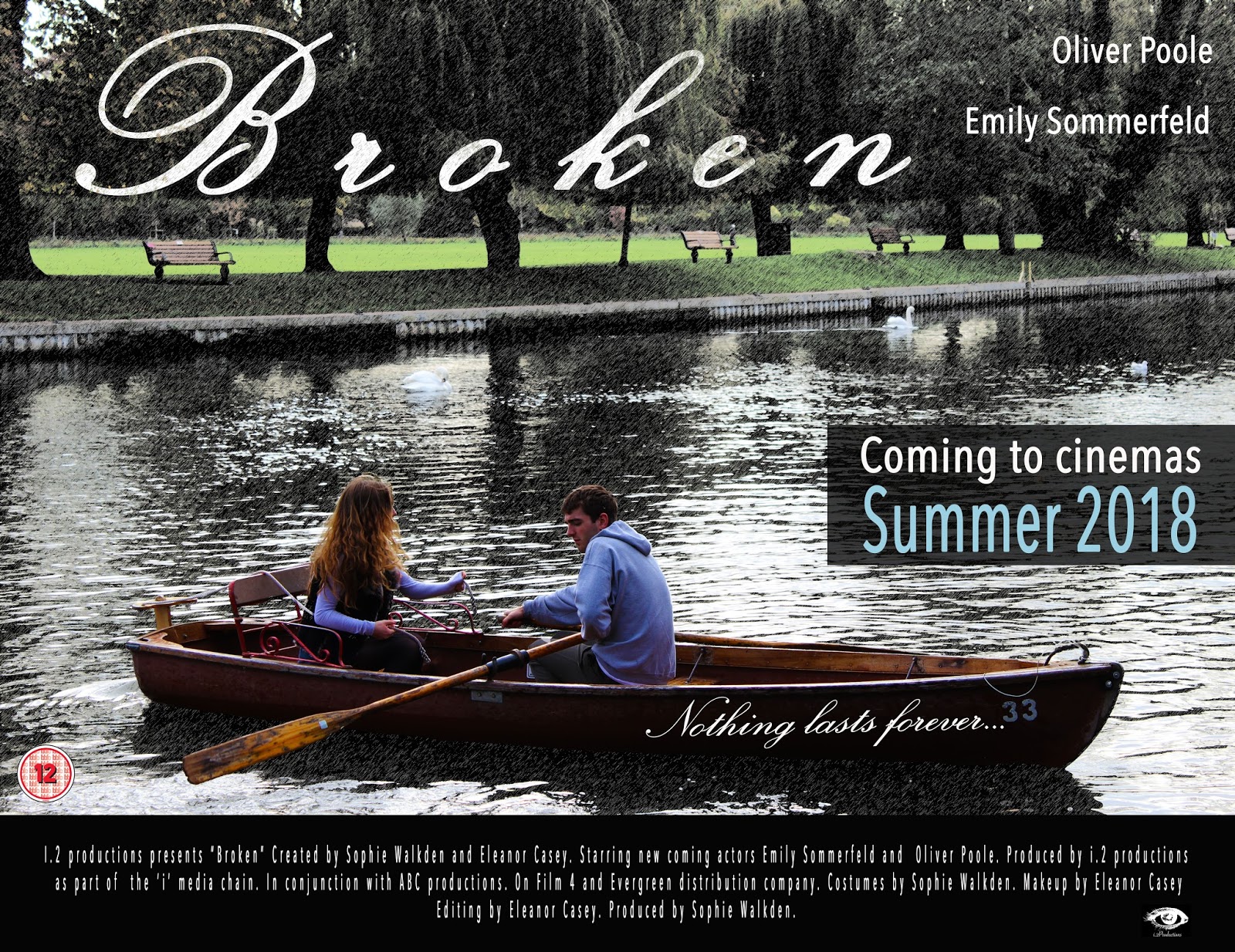
I also added the ident but simply reversed the colouring on photoshop in order to fit in with the black background. The title of the film, i also changed slightly by reducing the stroke in photoshop to make it appear broken. I changed the font for the actors in order to be able to read their names more clearly. The tag line has remained in the same place and also the font has stayed the same as it fits well with the title.
Post production- ancillary magazine front cover improved
After receiving feedback, i decided to change the main image to appeal better to the target audience. I did keep the colour scheme because i thought the colours worked well and stood out. I did increase the main images saturation to add warmth. I also reduced the amount of text on the cover, in order to show the characters more.

The main image clearly shows to individuals as a couple, which fits the target audience better. The font used is more typical of a magazine.
After revisiting my magazine front cover, i noticed that it did not quite fit the typical conventions of a magazine. The font needed changing slightly as did the colour scheme. I found that some font was lost in the image, so i added black boxes.


The main image clearly shows to individuals as a couple, which fits the target audience better. The font used is more typical of a magazine.
After revisiting my magazine front cover, i noticed that it did not quite fit the typical conventions of a magazine. The font needed changing slightly as did the colour scheme. I found that some font was lost in the image, so i added black boxes.

Sunday, 22 April 2018
Evaluation question three
What Have You Learned From Your Audience Feedback?- Film Trailer
Target audience is extremely important during my creation stages, they enabled me to make changes to make my trailer appeal more to my target audience. It has been crucial for me as their opinions/likes/dislikes have made me understand what my target audience expect and want out of a film trailer. To obtain audience feedback about my products, i asked 10 people with an even split of males and females within my target audience range to give me their opinion and thoughts on my product i have created.
During the process of making our trailer, we received a number of audience feedback. The first feedback we received was from our three initial ideas that we pitched to the class. It enabled us to receive a wider opinion of the product we wanted to create as well as what our audience wanted. We filmed the class discussion and it was uploaded to YouTube as well as my blog. One of the main points was that we needed to make sure our narrative is clear, as this was a key issue last year.
This feedback we received was extremely useful and gave us a staring point. We then were able to start brain storming our ideas and really begin to plan what we wanted to create. We decided to choose a romance genre as it was different to the genre we chose last year and also we found it interesting, we wanted to explore ways in which to present love on screen. When creating our idea, we did not consider the filming process, so we therefore decided to change it slightly to make it more achievable. We also wanted to subvert the stereotypical aspects in a romance, therefore changing the narrative slightly.
The second audience feedback we received was from two classmates, they agreed that the other female character playing the role of the party planner, was simply not clear enough. So we changed the character to be the woman in which he cheats with her on 'Daisy'. This creates drama as well as tension. We often asked for advice on our work with these two classmates, it was informal and not recorded but helped us a lot to develop our product.
We then showed our rough cut edit, which is also uploaded on YouTube and blogger, to fellow students and the class again. The feedback we received was extremely helpful, we collected the feedback on a Microsoft word document, making it easier to ensure we make all the changes people had made. The class fits within the target audience and consisted of both females and males therefore getting a wider opinion. The feedback mentioned how we needed to extend the duration of the titles, increase the volume of voice overs and add more dramatic shots of the actress Bridey. We also changed the non-diegetic music as we thought the atmosphere created wasn't quite what we wanted. The new song works well to create the mood ("Say something).
We also asked for feedback from our teacher before showing the class as he would point other aspects that perhaps the students wouldn't. He suggested that we add more shots with symbolism to represent the breaking of the relationship further making the narrative clearer. However, we did not want to conform to stereotypical conventions, so we did not feature the couple together in a few shots. We also filmed the shot of the lily dying to represent the death of the relationship. We did film a shot of china smashing (a mug) however, we felt it did not powerfully represent a break up. The feedback enabled us to sculpt our trailer to be more unique, unusual and professional , without the feedback we may not have achieved the trailer we had envisioned.
Target audience is extremely important during my creation stages, they enabled me to make changes to make my trailer appeal more to my target audience. It has been crucial for me as their opinions/likes/dislikes have made me understand what my target audience expect and want out of a film trailer. To obtain audience feedback about my products, i asked 10 people with an even split of males and females within my target audience range to give me their opinion and thoughts on my product i have created.
During the process of making our trailer, we received a number of audience feedback. The first feedback we received was from our three initial ideas that we pitched to the class. It enabled us to receive a wider opinion of the product we wanted to create as well as what our audience wanted. We filmed the class discussion and it was uploaded to YouTube as well as my blog. One of the main points was that we needed to make sure our narrative is clear, as this was a key issue last year.
This feedback we received was extremely useful and gave us a staring point. We then were able to start brain storming our ideas and really begin to plan what we wanted to create. We decided to choose a romance genre as it was different to the genre we chose last year and also we found it interesting, we wanted to explore ways in which to present love on screen. When creating our idea, we did not consider the filming process, so we therefore decided to change it slightly to make it more achievable. We also wanted to subvert the stereotypical aspects in a romance, therefore changing the narrative slightly.
The second audience feedback we received was from two classmates, they agreed that the other female character playing the role of the party planner, was simply not clear enough. So we changed the character to be the woman in which he cheats with her on 'Daisy'. This creates drama as well as tension. We often asked for advice on our work with these two classmates, it was informal and not recorded but helped us a lot to develop our product.
We then showed our rough cut edit, which is also uploaded on YouTube and blogger, to fellow students and the class again. The feedback we received was extremely helpful, we collected the feedback on a Microsoft word document, making it easier to ensure we make all the changes people had made. The class fits within the target audience and consisted of both females and males therefore getting a wider opinion. The feedback mentioned how we needed to extend the duration of the titles, increase the volume of voice overs and add more dramatic shots of the actress Bridey. We also changed the non-diegetic music as we thought the atmosphere created wasn't quite what we wanted. The new song works well to create the mood ("Say something).
We also asked for feedback from our teacher before showing the class as he would point other aspects that perhaps the students wouldn't. He suggested that we add more shots with symbolism to represent the breaking of the relationship further making the narrative clearer. However, we did not want to conform to stereotypical conventions, so we did not feature the couple together in a few shots. We also filmed the shot of the lily dying to represent the death of the relationship. We did film a shot of china smashing (a mug) however, we felt it did not powerfully represent a break up. The feedback enabled us to sculpt our trailer to be more unique, unusual and professional , without the feedback we may not have achieved the trailer we had envisioned.
I created this survey to receive final feedback on my products. I have described the data i gathered and asked them to elaborate on their reasoning for their answer. I included feedback on my ancillary products previously in my blog as i was confident using Photoshop and wanted to create what my audience wanted/expected. I received feedback from both of my teachers as well as my peers to ensure i conform to conventions of a poster and magazine front cover as well as the genre. Due to the feedback i received, i changed the colour scheme as well as typography to improve the appearance of my ancillaries. This made them fit better with the genre, but as i mentioned in another evaluation i lost the synergistic links between the products.
Below are the presentations showing the audience feedback for all three products i have created.
Sunday, 15 April 2018
Evaluation question one
In what ways does your media product use, develop or challenge forms and conventions of real media products?
Conventions and forms are elements that are used to make a media product recognisable to an audience. These include both macro and micro elements. Micro elements is where you include elements such as high/low key lighting, quick cuts and location. Macro elements look at larger aspects and themes such as theorists like Todorov and his narrative theory. Both of these forms are needed in order for the product to be liked by the target audience. After researching into many media products, it has led me to discover the codes and conventions that make them recognisable.
Film Trailer Conventions Include;
Magazine Cover Conventions Include;
Film Poster Conventions Include;
 Our film trailer is a of a romance genre, an it does subvert as well as conform to the typical conventions of a romance film. Our trailer does conform to many of the typical forms of a trailer. For example, we have included voice overs from the female characters, showing that the story will be told from her point of view. In addition, Todorov's narrative theory of equilibrium and disequilibrium is shown. The narrative begins with the couple in a happy relationship, there is another female character seen which causes a disruption to the equilibrium. We decided to end the trailer on an uncertain ending, leaving the target audience keen to watch the film to discover the ending. This is challenging Todorov's theory as the disequilibrium is not resolved. It is conventional of a trailer however, to leave it on a cliffhanger as the audience does not know everything that is going on, the narrative is clear but the resolution is unclear. It sparks enigma as the audience wants to know what It going to happen to all the characters in the film. The audience want to know all the details and the fact it is told by the female character is even more intriguing as the audience then creates a rapport with the character and can relate to the circumstances.


Regarding my ancillary products (poster and a magazine front cover),I decided to present these on my media blog. This challenges the conventions of media products as stereotypically these products are primarily distributed in print form. The posters are printed for billboards and the magazine front cover is printed alongside the rest of the magazine. Blogger s a digital platform and I thought it would be a good idea of publishing my products. My blog is published online so can be seen by many online users. It can also be shared through a number of medua platforms. It shows my progression of my work and also print work is become less popular, more people are online as it is easy, quick and saves money. It is instant access of many different products.
Conventions and forms are elements that are used to make a media product recognisable to an audience. These include both macro and micro elements. Micro elements is where you include elements such as high/low key lighting, quick cuts and location. Macro elements look at larger aspects and themes such as theorists like Todorov and his narrative theory. Both of these forms are needed in order for the product to be liked by the target audience. After researching into many media products, it has led me to discover the codes and conventions that make them recognisable.
Film Trailer Conventions Include;
- Film Title
- Film Production Logos
- Social Media
- Music and voice overs
- Character Introductions
- Release Date
Magazine Cover Conventions Include;
- Masthead
- Tagline
- Cover Lines
- Variety of Font Types
- Main Image
- Date and Barcode
Film Poster Conventions Include;
- Main Image
- Release Date
- Film Title
- Billing Board
- Actor Names
- Review and Rating
 Our film trailer is a of a romance genre, an it does subvert as well as conform to the typical conventions of a romance film. Our trailer does conform to many of the typical forms of a trailer. For example, we have included voice overs from the female characters, showing that the story will be told from her point of view. In addition, Todorov's narrative theory of equilibrium and disequilibrium is shown. The narrative begins with the couple in a happy relationship, there is another female character seen which causes a disruption to the equilibrium. We decided to end the trailer on an uncertain ending, leaving the target audience keen to watch the film to discover the ending. This is challenging Todorov's theory as the disequilibrium is not resolved. It is conventional of a trailer however, to leave it on a cliffhanger as the audience does not know everything that is going on, the narrative is clear but the resolution is unclear. It sparks enigma as the audience wants to know what It going to happen to all the characters in the film. The audience want to know all the details and the fact it is told by the female character is even more intriguing as the audience then creates a rapport with the character and can relate to the circumstances.
Throughout my research, I have established that when film trailers are published they are often shared on YouTube which is a video sharing website. They are also shown on other medias as well as TV. They are also promoted before feature films in a cinema. We decided it would be more cost effective and most appropriate. It is a free website and its social platform has increased rapidly the past few years, it is extremely popular with our target audience age range. It has been running for around 12 years and claims to have around 1 billion active users every month. This means the trailer has a wider demographic perhaps going beyond our target audience. In addition, it is easy to view trailers as often before the video you clicked plays, adverts are shown. Another strength of uploading our trailer to this site is that it is easy to share on other social media sites such as Instagram, Snapchat and Twitter. By sharing it on social medias, its a
good way to receive feedback. It is a very successful site that can promote the product well and create a hype for the film release.
good way to receive feedback. It is a very successful site that can promote the product well and create a hype for the film release.
Regarding my ancillary products (poster and a magazine front cover),I decided to present these on my media blog. This challenges the conventions of media products as stereotypically these products are primarily distributed in print form. The posters are printed for billboards and the magazine front cover is printed alongside the rest of the magazine. Blogger s a digital platform and I thought it would be a good idea of publishing my products. My blog is published online so can be seen by many online users. It can also be shared through a number of medua platforms. It shows my progression of my work and also print work is become less popular, more people are online as it is easy, quick and saves money. It is instant access of many different products.
Evaluation question two
How effective is the combination of your main product and ancillary texts?

Thursday, 29 March 2018
Evaluation question four
How did you use media technologies in the construction and research, planning and evaluation stages? Reflection AS to A2


Tuesday, 27 March 2018
Post production- editing the titles

The font we have used for our trailer is 'Severak'. It is a clear to read font but also looks good, we spent time in choosing the font as we want to ensure it fits with the genre. We did get feedback from peers as well to ensure the font looked good. We placed the titles where we thought they would work well, once placing them we asked peers for audience feedback. Many said to begin with, that there were too many titles but liked what the titles said. After receiving the feedback, we edited out titles which we thought weren't needed. We then once again got feedback:
Skye- "I really like the font, its simple and you can read it clearly. I think the titles are on for a good amount of time, not too long. I think the minimal titles work well as the audience can focus more on the narrative."
To create our inter-titles, we used Premiere pro's title tool. They are all on blank screens to simply split up the shots and make it more dramatic. We also altered the title font, timing and font size on Premiere pro.

The final title is announcing the the film again and when it will be in cinemas. The title of the film is bigger to simply make the audience remember the title so they will go and see it in cinemas. The font is still 'Severak' but the film title has been made bolder than the other font on screen.
Monday, 26 March 2018
Post production- transitions
 The main transition we used for the visuals as well as the titles was the 'dip to black' that you can see highlighted in the screen shot below. We thought that the transition would create a dramatic effect but would also make the shots more emotional. The transitions just simply make the trailer flow better but to exaggerate certain shots.
 Post production- Audience feedback on Ancillary products
Production and post production- updated location
After filming in stratford, we plan to film in the village to get the other shots. This will make it easier for the actors to get to the location, giving us more time to film. It allowed us to also save money on travelling.
 |
| We filmed near the church, Rectory Lane and Church lane. We then filmed in a field near by where it had a lake. We were able to walk to the new locations. We liked the appearance of the lanes and how they were quite secluded. They also had a very traditional feel, which fits with the genre; traditional often has romantic connotations. Once again, we relied on natural light, but due to the position we managed to get good lighting. It wasn't too dark but did create a dark feel, to show the lack of emotion. Also the fact we shot near a church symbolizes death and morality, representing the fracture. |
Sunday, 25 March 2018
Post production- editing the colour gradient
 |
| The left image, is the original shot. The right image is where the saturation has been reduced slightly. |

Despite the fact our film is a romance film, the trailer does show the sad emotion of the relationship breaking. We wanted to express the sadness through the colour gradient as dull colours have connotations of depression and misery. We felt that b doing this, it will represent the characters melancholy mood. A typical convention of a romance film is bright and warming colours, so to subvert that, it will show the change in emotion.
When the breaking of the relationship occurs, we altered the colour gradient slightly to represent the sadness the character will feel. The saturation is lowered slightly, to reduce the colour brightness which therefore, represents the lack of happiness the character feels in the situation. It also represnets the lack of emotion the character feels towards 'Charlie'.
The reducing of the saturation, has taken away the redness in the characters cheeks which represents the loss of warmth she once had.
This screenshot shows how we altered the vignette around the images.This was used to represent the fact it was the past and to foreshadow that not everything was as it seemed.
Post production- colour scheme for the ancillary products
 Poster:
The colour scheme is minimal on the poster; black, white and sky blue. The sky blue adds colour to the poster and also makes it stand out, appealing more to the audience and grabbing their attention. It also makes it clearer to see, using contrast colours, further appealing to the audience. The light typography will contrast with the dark background and when there is a light background i used a black box. I reduced the opacity of the box to make the font clear. i reversed the colours on the ident as well appearing more professional without the white boarder.
Magazine:
For the magazine, the colour scheme is white, red and black. The red contrasts with the other colours and stands out, drawing the reader in. The red box also exaggerates the font and makes it clear to the target audience. In addition, the black contrasts with the light background. The red font is used to draw in the reader, so is used on words such as 'must' and the actors names.
Friday, 23 March 2018
Post production- voice overs
These are the new voice overs that will be in our trailer.
Daisy- "I can't get him out of my mind"
Daisy- "He treats me like a stranger!"
Character of Bridey- "I'll see you in the usual spot, I'm wearing something you might like."
Daisy- "Just leave"
Daisy- "I can't get him out of my mind"
Daisy- "He treats me like a stranger!"
Character of Bridey- "I'll see you in the usual spot, I'm wearing something you might like."
Daisy- "Just leave"
Post production- non-diegetic sound updated and editing
When adding the music we needed to consider the loudness along with the voice overs. We also needed to ensure that the voiceovers aren't lost in the music. The speed of the music was also changed slightly to make it more emotional and dramatic.
We decided to to lower the volume of the non-diegetic music and increase the volume of the voice overs to make it clearer to the audience. All of the editing for the sound was done on premiere pro.
We also added a Phone vibration to represent an intrusion in the relationship and to show the disequilibrium.
We decided to to lower the volume of the non-diegetic music and increase the volume of the voice overs to make it clearer to the audience. All of the editing for the sound was done on premiere pro.
We also added a Phone vibration to represent an intrusion in the relationship and to show the disequilibrium.
Post production- updated script
After recording the script and incorporating the voice overs into the trailer, it is clear that the voice overs of the male did not work as well as we anticipated. We decided to continue with the female voice over but also add the other female characters voice, the audience then only get a point of view from the two females in the trailer. In addition, we thought it would make it more dramatic and further clarify the narrative.
The voice overs were recorded on a microphone in a soundproof room in order to improve the quality as many said that the voice overs needed to be louder.
Daisy- "I can't get him out of my mind"
Daisy- "He treats me like a stranger!"
Character of Bridey- "I'll see you in the usual spot, I'm wearing something you might like."
Daisy- "Just leave"
The non-diegetic music will then fade out.
The voice overs were recorded on a microphone in a soundproof room in order to improve the quality as many said that the voice overs needed to be louder.
Daisy- "I can't get him out of my mind"
Daisy- "He treats me like a stranger!"
Character of Bridey- "I'll see you in the usual spot, I'm wearing something you might like."
Daisy- "Just leave"
The non-diegetic music will then fade out.
Post production- non-diegetic sound updated (voice overs)
The clarity of the voice overs weren't clear, so we decided to re-record them. In addition, after receiving more audience feedback it is clear that we needed to fill the gaps where no footage is being shown. It was suggested that we add a voice over of the other female (Bridey Aries).
They were recorded on a microphone in a sound proof room to make the sound clearer.
They were recorded on a microphone in a sound proof room to make the sound clearer.
Thursday, 22 March 2018
Post production-lighting
When we planned our filming days, we looked carefully at the weather and also ensured that the times we were filming we would have the best light (mid-day). In addition, there were a few days we planned to film that we had to cancel due to the restriction of the weather. For example, it rained one day, and due to the heaviness of the rain and the health and safety of the actors as well as Sophie and I, we had to rearrange the day. Our equipment would not enable us to film, in the rain.
The other days in which we filmed, we were very lucky as we had clear blue skies and sun. The shots looked really clear and we used it well in order to create the shadows we wanted.
Overall, we did not need to use a light and/or tripod. It made us have more filming days due to restricted daylight, but overall it worked well.
The other days in which we filmed, we were very lucky as we had clear blue skies and sun. The shots looked really clear and we used it well in order to create the shadows we wanted.
Overall, we did not need to use a light and/or tripod. It made us have more filming days due to restricted daylight, but overall it worked well.
Tuesday, 20 March 2018
Post production- class feedback on rough cut edit
Rory-Large variety of great shots and there was a very clear narrative. Titles could be on screen for longer and some of the voice overs are quieter than the background music.
Sophie-Slow down and improve your titles.
Rossi-Extend title length, include film title and allow so can hear voiceover at end. Good narrative.
Lily-Lower the volume of the voice over, otherwise great aesthetic shots.
Emily-Really liked the shots, possibly different font for the writing.
Skye-Make the speech louder and clearer.
Claudia-Make written text on screen last longer.
We will take all this feedback into consideration and continue with our final edit. We also received more feedback from Skye and Sophie, so we will carefully listen to there advice and make the changes.
Sophie-Slow down and improve your titles.
Rossi-Extend title length, include film title and allow so can hear voiceover at end. Good narrative.
Lily-Lower the volume of the voice over, otherwise great aesthetic shots.
Emily-Really liked the shots, possibly different font for the writing.
Skye-Make the speech louder and clearer.
Claudia-Make written text on screen last longer.
We will take all this feedback into consideration and continue with our final edit. We also received more feedback from Skye and Sophie, so we will carefully listen to there advice and make the changes.
Post production- audience feedback for rough cut edit 2
This is the audience feedback for our rough cut edit, we will make improvements in order for it to appeal better to our target audience. The general audience feedback was to edit our titles, increasing the duration as well as altering the font. We also just needed to enhance the sound of the voiceovers and change the saturation of the shots.
Subscribe to:
Posts (Atom)

-
 Conventions of a poster: A poster is any piece of printed paper designed to be attached to a wall or vertical surface. Typically posters ...
 -
Date Scene Interior/exterior Day/night Location Shot description ...
-
 In my film there is going to be a montage of dates and in these shots i think that my two characters would look better in casual clothing as...