How did you use media technologies in the construction and research, planning and evaluation stages? Reflection AS to A2
Thursday, 29 March 2018
Tuesday, 27 March 2018
Post production- editing the titles
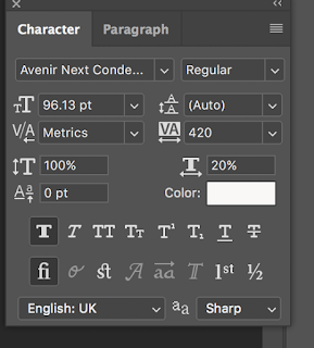
The font we have used for our trailer is 'Severak'. It is a clear to read font but also looks good, we spent time in choosing the font as we want to ensure it fits with the genre. We did get feedback from peers as well to ensure the font looked good. We placed the titles where we thought they would work well, once placing them we asked peers for audience feedback. Many said to begin with, that there were too many titles but liked what the titles said. After receiving the feedback, we edited out titles which we thought weren't needed. We then once again got feedback:
Skye- "I really like the font, its simple and you can read it clearly. I think the titles are on for a good amount of time, not too long. I think the minimal titles work well as the audience can focus more on the narrative."
To create our inter-titles, we used Premiere pro's title tool. They are all on blank screens to simply split up the shots and make it more dramatic. We also altered the title font, timing and font size on Premiere pro.
To create our trailer title, we used Adobe After effects and Bridge. After effects works with Premiere pro, making it easy to add our title. Bridge enables us to see what the effect will look like. The effect we used was the 'raining' effect, this makes the letters appear to fall into the shot. The title then maintains on the water allowing the audience to read it. The fact it 'rains' in signifies that this may be a sad romance film, it is a simple form of pathetic fallacy through the title.
The final title is announcing the the film again and when it will be in cinemas. The title of the film is bigger to simply make the audience remember the title so they will go and see it in cinemas. The font is still 'Severak' but the film title has been made bolder than the other font on screen.
Monday, 26 March 2018
Post production- transitions
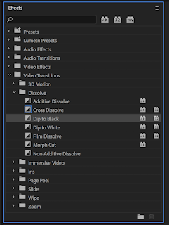 The main transition we used for the visuals as well as the titles was the 'dip to black' that you can see highlighted in the screen shot below. We thought that the transition would create a dramatic effect but would also make the shots more emotional. The transitions just simply make the trailer flow better but to exaggerate certain shots.
 Post production- Audience feedback on Ancillary products
Production and post production- updated location
After filming in stratford, we plan to film in the village to get the other shots. This will make it easier for the actors to get to the location, giving us more time to film. It allowed us to also save money on travelling.
Sunday, 25 March 2018
Post production- editing the colour gradient
 |
| The left image, is the original shot. The right image is where the saturation has been reduced slightly. |
Despite the fact our film is a romance film, the trailer does show the sad emotion of the relationship breaking. We wanted to express the sadness through the colour gradient as dull colours have connotations of depression and misery. We felt that b doing this, it will represent the characters melancholy mood. A typical convention of a romance film is bright and warming colours, so to subvert that, it will show the change in emotion.
When the breaking of the relationship occurs, we altered the colour gradient slightly to represent the sadness the character will feel. The saturation is lowered slightly, to reduce the colour brightness which therefore, represents the lack of happiness the character feels in the situation. It also represnets the lack of emotion the character feels towards 'Charlie'.
The reducing of the saturation, has taken away the redness in the characters cheeks which represents the loss of warmth she once had.
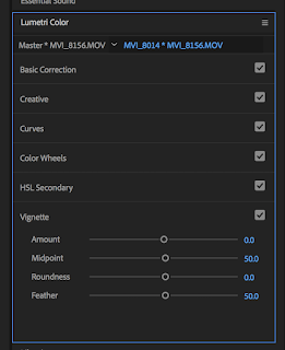
This screenshot shows how we altered the vignette around the images.This was used to represent the fact it was the past and to foreshadow that not everything was as it seemed.
Post production- colour scheme for the ancillary products
 Poster:
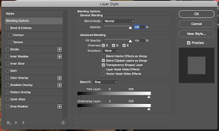
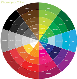
The colour scheme is minimal on the poster; black, white and sky blue. The sky blue adds colour to the poster and also makes it stand out, appealing more to the audience and grabbing their attention. It also makes it clearer to see, using contrast colours, further appealing to the audience. The light typography will contrast with the dark background and when there is a light background i used a black box. I reduced the opacity of the box to make the font clear. i reversed the colours on the ident as well appearing more professional without the white boarder.
Magazine:
For the magazine, the colour scheme is white, red and black. The red contrasts with the other colours and stands out, drawing the reader in. The red box also exaggerates the font and makes it clear to the target audience. In addition, the black contrasts with the light background. The red font is used to draw in the reader, so is used on words such as 'must' and the actors names.
Friday, 23 March 2018
Post production- voice overs
These are the new voice overs that will be in our trailer.
Daisy- "I can't get him out of my mind"
Daisy- "He treats me like a stranger!"
Character of Bridey- "I'll see you in the usual spot, I'm wearing something you might like."
Daisy- "Just leave"
Daisy- "I can't get him out of my mind"
Daisy- "He treats me like a stranger!"
Character of Bridey- "I'll see you in the usual spot, I'm wearing something you might like."
Daisy- "Just leave"
Post production- non-diegetic sound updated and editing
When adding the music we needed to consider the loudness along with the voice overs. We also needed to ensure that the voiceovers aren't lost in the music. The speed of the music was also changed slightly to make it more emotional and dramatic.
We decided to to lower the volume of the non-diegetic music and increase the volume of the voice overs to make it clearer to the audience. All of the editing for the sound was done on premiere pro.
We also added a Phone vibration to represent an intrusion in the relationship and to show the disequilibrium.
Post production- updated script
After recording the script and incorporating the voice overs into the trailer, it is clear that the voice overs of the male did not work as well as we anticipated. We decided to continue with the female voice over but also add the other female characters voice, the audience then only get a point of view from the two females in the trailer. In addition, we thought it would make it more dramatic and further clarify the narrative.
The voice overs were recorded on a microphone in a soundproof room in order to improve the quality as many said that the voice overs needed to be louder.
Daisy- "I can't get him out of my mind"
Daisy- "He treats me like a stranger!"
Character of Bridey- "I'll see you in the usual spot, I'm wearing something you might like."
Daisy- "Just leave"
The non-diegetic music will then fade out.
Post production- non-diegetic sound updated (voice overs)
The clarity of the voice overs weren't clear, so we decided to re-record them. In addition, after receiving more audience feedback it is clear that we needed to fill the gaps where no footage is being shown. It was suggested that we add a voice over of the other female (Bridey Aries).
They were recorded on a microphone in a sound proof room to make the sound clearer.
They were recorded on a microphone in a sound proof room to make the sound clearer.
Thursday, 22 March 2018
Post production-lighting
When we planned our filming days, we looked carefully at the weather and also ensured that the times we were filming we would have the best light (mid-day). In addition, there were a few days we planned to film that we had to cancel due to the restriction of the weather. For example, it rained one day, and due to the heaviness of the rain and the health and safety of the actors as well as Sophie and I, we had to rearrange the day. Our equipment would not enable us to film, in the rain.
The other days in which we filmed, we were very lucky as we had clear blue skies and sun. The shots looked really clear and we used it well in order to create the shadows we wanted.
Overall, we did not need to use a light and/or tripod. It made us have more filming days due to restricted daylight, but overall it worked well.
Tuesday, 20 March 2018
Post production- class feedback on rough cut edit
Rory-Large variety of great shots and there was a very clear narrative. Titles could be on screen for longer and some of the voice overs are quieter than the background music.
Sophie-Slow down and improve your titles.
Rossi-Extend title length, include film title and allow so can hear voiceover at end. Good narrative.
Lily-Lower the volume of the voice over, otherwise great aesthetic shots.
Emily-Really liked the shots, possibly different font for the writing.
Skye-Make the speech louder and clearer.
Claudia-Make written text on screen last longer.
We will take all this feedback into consideration and continue with our final edit. We also received more feedback from Skye and Sophie, so we will carefully listen to there advice and make the changes.
Post production- audience feedback for rough cut edit 2
This is the audience feedback for our rough cut edit, we will make improvements in order for it to appeal better to our target audience. The general audience feedback was to edit our titles, increasing the duration as well as altering the font. We also just needed to enhance the sound of the voiceovers and change the saturation of the shots.
Post production- Rough cut edit 2
We showed the media class our film during a lesson in order to receive feedback on our film, so we are able to make more improvements and if needs be, to re-film. We received verbal after it was shown.
Post production- career path
I did the makeup for our film, i really enjoy doing makeup and would love this to be my career. I decided to email the man who managed the makeup for all the Harry Potter films, Nick Dudman. I received an email back saying i would be able to do work experience with him when he returns to the UK and also gave me advice on how to get in to the industry. I am extremely excited to be able to work with him and learn new techniques and make me progress my skills.
Post production- Rough cut edit
We still need to add titles and cut more shots out to shorten the film. Also we need to add voice overs and record the song in order to avoid copyright.
Post production- sound review
After receiving feedback from students, we have decided to change the music slightly. We have decided to get rid of the voice singing the song as we have voice overs and can be too overwhelming moreover, they said they liked the backing track as the instrumental worked well with the shots. Furthermore, they said we need to add other music to establish that the relationship is breaking and just to make the narrative clearer.
We will look on Purple planet and Bensounds to find another song to signify the falling apart of the couple.
We will look on Purple planet and Bensounds to find another song to signify the falling apart of the couple.
Post production- non-diegetic sound change
After receiving audience feedback for our first rough cut edit, it was clear the sound needed to change. We asked and got a number of suggestions and decided to choose 'Say something' by A great big world. However, we used a karaoke version to make it more dramatic and so you can hear the voice overs. The music still needs to be altered slightly and so do the voice overs, but after being given more feedback, people found the shots worked so much better with the music.
Tuesday, 13 March 2018
Production- update on props
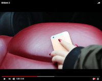
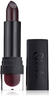 The burgundy/red lipstick has a number of connotations. We used the colour the portray the idea of evil and danger. It emphasises the fact her character is going to be a danger to their relationship.
 In addition, the use of the car shows how the mistress has power over the girlfriend. One again, the colour red is seen through the use of costume (her nail colour) and the red seats in the car. It presents her as a dangerous, passionate character; suggesting she will not give up easily until she gets what she wants. She contrasts well with the girlfriend, Daisy, who is a simple and natural character.
The phone shows she has communication with Charlie, once again holding the idea that she has more control than Daisy. The slight pinkness of the phone has connotations of love; it enables the audience to completely understands the character's intentions and exaggerates the idea that this love is not going to last.
Production- communication
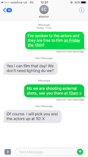 As our actors come to the same school as us it made it easier to contact them. We also got their numbers so we could message them. We often arranged what days to meet in person, then messaged them with extra details to ensure they didn't forget. We also put in our calendars, the days we were filming and made sure that everyone was sure on the dates and times. We sometimes arranged to film during lesson time as well due to the restriction of natural light.
Monday, 12 March 2018
Production- updated casting
 |
| Bridey Aries- played the role of the other paramore. |
Bridey originally auditioned for the part of 'Daisy' however, she didn't quite fit the idea we had in our head. So, after long discussion, we decided her appearance and attitude would fit the role of the other paramore. Her fierce characterisation worked well and we thought it would come across well on screen.
We liked her look and the main thing that drew us in were her eyes, they are very striking and thought visually she would work well with the character we had in mind. In addition, her appearance contrasts well with Emily's. They are two complete opposites which can be shocking to the audience and also spark enigma, making them think who is going to win him over.
Post production- ancillary editing for the poster
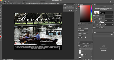
To create my poster, I used Photoshop. When I knew I had to create a poster, this is immediately the image that came to mind. I thought that it visually looked good and has many connotations but represents the couple well together. The fact they are in water signifies the fact that water can be dangerous and not as expected. It shows that he is in control, and suggests that she is trying to direct him. It further suggests that he will be the cause of the breaking of the relationship.
Thursday, 8 March 2018
Ancillary product one- poster improvements
The poster has got more vibrance to make it stand out, it also makes the font slightly clearer and easier to read. After receiving feedback, that is what i wanted to focus on. I increased the saturation, vibrance and contrast. In the one below, i have added the small print where it introduces the actors, the company and Sophie and I.
Production- choice of shots
We decided to use the dying of a flower to signify the breaking down or dying of the relationship. We sped it up to make it more dramatic. The flower we chose was a lily, because lilies are often representative of death and funerals. Also, the red has many connotations of death, passion, love and maybe danger. In our film trailer, the red will signify the death of love. The white background contrasts well with the colour and exaggerates the red.
Monday, 5 March 2018
Post production- ancillary editing for the magazine front cover
After using Photoshop last year to create our ident, I felt more confident to use it this year. I used YouTube to understand how to do certain tasks. I spent more time this year in searching and trying out different things to ensure I challenge myself.
Subscribe to:
Comments (Atom)
-
Conventions of a poster: A poster is any piece of printed paper designed to be attached to a wall or vertical surface. Typically posters ...
-
Date Scene Interior/exterior Day/night Location Shot description ...
-
The voice overs will provide more structure to the trailer and enable the audience to completely understand the narrative. They will be adde...


