To create my poster, I used Photoshop. When I knew I had to create a poster, this is immediately the image that came to mind. I thought that it visually looked good and has many connotations but represents the couple well together. The fact they are in water signifies the fact that water can be dangerous and not as expected. It shows that he is in control, and suggests that she is trying to direct him. It further suggests that he will be the cause of the breaking of the relationship.
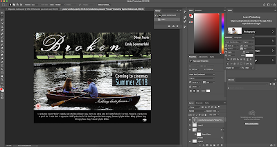 |
| To begin with, I imported the image into Photoshop. I then began to alter the image. There are two layers, the first layer is where I reduced the image saturation but then sharpened the image as well as enhance the characters to make them stand out from the rest of the image. I had to do this because I am aware of how much space there is surrounding the couple. I then added a filter to create a grainy effect. I then darkened the effect in order to make it easier for the audience to read the text. The screenshot above was my general set up when completing the process. |
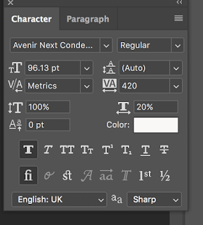 |
| The majority of the text is white, the colour scheme works well to stand out clearly allowing the audience to read the information. I did add a black box using the paint pot tool to add text at the bottom of the page, this then fits the typical conventions of a poster. With the title, I used a different font (French script) to fit the conventions of a romance film. This type of font is very stereotypical as it is associated with romance. I then reduced the opacity of the font; allowing it to fade into the background slightly and added a 'shattered' effect to correlate with the name of the film. The other colour I used was a sky blue, this enhances the text in comparison with the others on the poster. It also gives the audience the main information they need. |
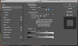 |
| I used this tool to alter the main title. This allowed me to make the font bold but also give me the 'shattered' effect was after. I used the 'stroke' tool to define the font. I also experiment with other tools to see how they altered the text but I found that the stroke tool worked best and appeared to be more natural. By completing two ancillaries it has allowed me to develop my knowledge on Photoshop and made me feel more confident. If I needed help I used YouTube tutorials. |


No comments:
Post a Comment