The second day of filming, we were lucky with the weather. It was a typical bright winter's day, which worked well to show a passing of time. We didn't film as much due the the actors being restricted to time. So we did have to film on another day in which we only required one of the actors, we have one more filming day. It has been difficult because one of our actors isnt readily available so it has required a lot of planning.
One of our struggles in the bright sun, was focusing the camera. It did take longer to film. In addition, we were unable to get the exact location we wanted due to the restricted time, so we did have to compromise but we worked with it and ensure we avoided getting certain aspects of the environment in it.
On the third day, i drove to the location to save time, we also precisely planned what shots we wanted to get. It was a lot easier as we only had one of the characters.
When we film on the fourth day, we only require a few shots and this will be done effectively as the shots have been planned.
Friday, 26 January 2018
Tuesday, 16 January 2018
Production- First day of production
 |
| Emily's hair was naturally curly, I did her makeup very natural as well. She wore a casual outfit; skirt, trainers and a coat due to the cold weather. |
 |
| The couple seen on the rowing boat, we paid £12 for an hour on the boat in which we managed to get a number shots. |
 |
| Ollie laying the role as Charlie, wearing casual clothing. The jumper was needed as the weather was quite cold. |
Wednesday, 10 January 2018
Post production- poster mood board
I plan to make a landscape poster as I have decided the image I wish to use but also feel that its different to what people often use. I have looked at a number of romance posters and focused on the font as it often indicates immediately to the audience what type of film it will be. The fact that our film is a romance but also shows something unexpected, I need to take it in to consideration and ensure I get that across in my poster. Most of the posters have used a white, black and blue colour scheme. I think the colours work well together and also stand out, giving the audience the necessary information.
I have noticed that the layout of a poster is similar in most of them. The landscape posters have positioned the text to one side, they have also altered the sizing of certain words to make them more dominant. There is minimal text on posters, they simply just show the most important information. All the images have quite bold colours and the two lovers are the main focus of the image. Often water is seen in some sort of form which can perhaps hold some significance. There is warmth in the images or warmth from the characters which I will consider to achieve. I will consider brightening the characters to make them the main feature.


I have noticed that the layout of a poster is similar in most of them. The landscape posters have positioned the text to one side, they have also altered the sizing of certain words to make them more dominant. There is minimal text on posters, they simply just show the most important information. All the images have quite bold colours and the two lovers are the main focus of the image. Often water is seen in some sort of form which can perhaps hold some significance. There is warmth in the images or warmth from the characters which I will consider to achieve. I will consider brightening the characters to make them the main feature.


Post production- magazine mood board
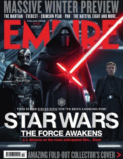
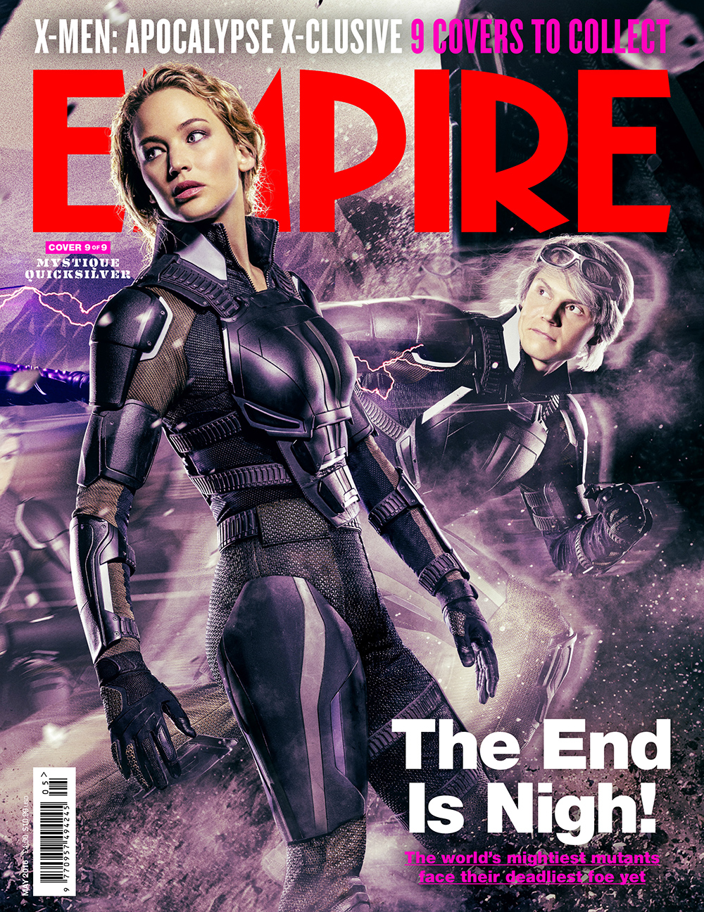
I focused on the company 'Empire' as they are a movie magazine. They are incredibly popular and have many different front covers that will give me inspiration. I will take into consideration; the colour scheme they use and the positioning of the text. I will also consider how they write certain things, the font sizing and buzz words. I have noticed that they use the films font for the title of the film, so I will have to carefully consider what my films font will be. The tag lines are at the very top of the page and often in capitals. In addition, the masthead is often obstructed slightly by the main image.


Empire often focuses on action films, I could not find many front covers that were promoting a romance film, I must be careful and consider my target audience when creating this magazine front cover. To create my front cover I will focus mainly on the layout and colour schemes used. The colours they use often relate to the film as well as the film genre. There images are very strong and powerful, they are of a high definition.
Production- day four of filming
Day four, we filmed outside of school where we had the actress Bridey play the character ,Charlie's, other love. We filmed in my car because i had red seats and the colour red has many connotations. We filmed her preparation to meet him in order for the audience to see her motives and that Charlie is cheating.
We also filmed near a field, this is during our lessons, in which we filmed shots of the couple arguing. We also filmed extreme close ups to show the characters emotion. The dull weather worked well as the pathetic fallacy represented the emotion. We did not spend long filming, these were simply filling shots to ensure the narrative is clear.
We also filmed near a field, this is during our lessons, in which we filmed shots of the couple arguing. We also filmed extreme close ups to show the characters emotion. The dull weather worked well as the pathetic fallacy represented the emotion. We did not spend long filming, these were simply filling shots to ensure the narrative is clear.
Production- Choice of shots
In our trailer there are a number of shots that include couples to highlight the idea of relationships, for example the first shows the couple hand in hand walking away from the camera and in comparison, the binary opposites walk towards the camera. This perhaps suggests that the couple will have a long lasting relationship. Throughout the scenes there are other visuals of couples, emphasizing the relationship status.
Moreover, there are a series of shots that alo suggest loneliness. This foreshadows that something may cause a break in the relationship. For example, the shot of the one swan, swans are often seen in pairs. This is one of the strongest shots to foreshadow what is to come. This shot also breaks up the footage, allowing it to flow better.
In addition, the series of close up shots of the female shows that she is the main character and perhaps the story is told more from her side of view. It also shows her emotion and develops the mood. By showing repeated close up shots of the two, creates and develops the intimate relationship, which comes across to the audience.
When the character Daisy is seen presumably leaving Charlie, we slowed down the shots to create a sense of being delirious and panic. She has seen her partner cheating and does not know what to do. It slows down the thought process and simply builds/creates the atmosphere and tension.
Moreover, towards the end of the trailer a shot of a holly bush is shown to show the progression of time however, the red berries on it symbolise the idea of love but also suggest danger. In our trailer, the shot is used to signify the breaking down of the relationship.
 |
| The binary opposites are seen in the bottom right hand side of the shot. |
Moreover, there are a series of shots that alo suggest loneliness. This foreshadows that something may cause a break in the relationship. For example, the shot of the one swan, swans are often seen in pairs. This is one of the strongest shots to foreshadow what is to come. This shot also breaks up the footage, allowing it to flow better.
 |
| The single swan in the river highlights the idea that relationship may not be as perfect as it seems. |
When the character Daisy is seen presumably leaving Charlie, we slowed down the shots to create a sense of being delirious and panic. She has seen her partner cheating and does not know what to do. It slows down the thought process and simply builds/creates the atmosphere and tension.
 |
| The colour red has negative connotations to symbolize the breaking of the relationship. |
Subscribe to:
Comments (Atom)
-
Conventions of a poster: A poster is any piece of printed paper designed to be attached to a wall or vertical surface. Typically posters ...
-
Date Scene Interior/exterior Day/night Location Shot description ...
-
The voice overs will provide more structure to the trailer and enable the audience to completely understand the narrative. They will be adde...


